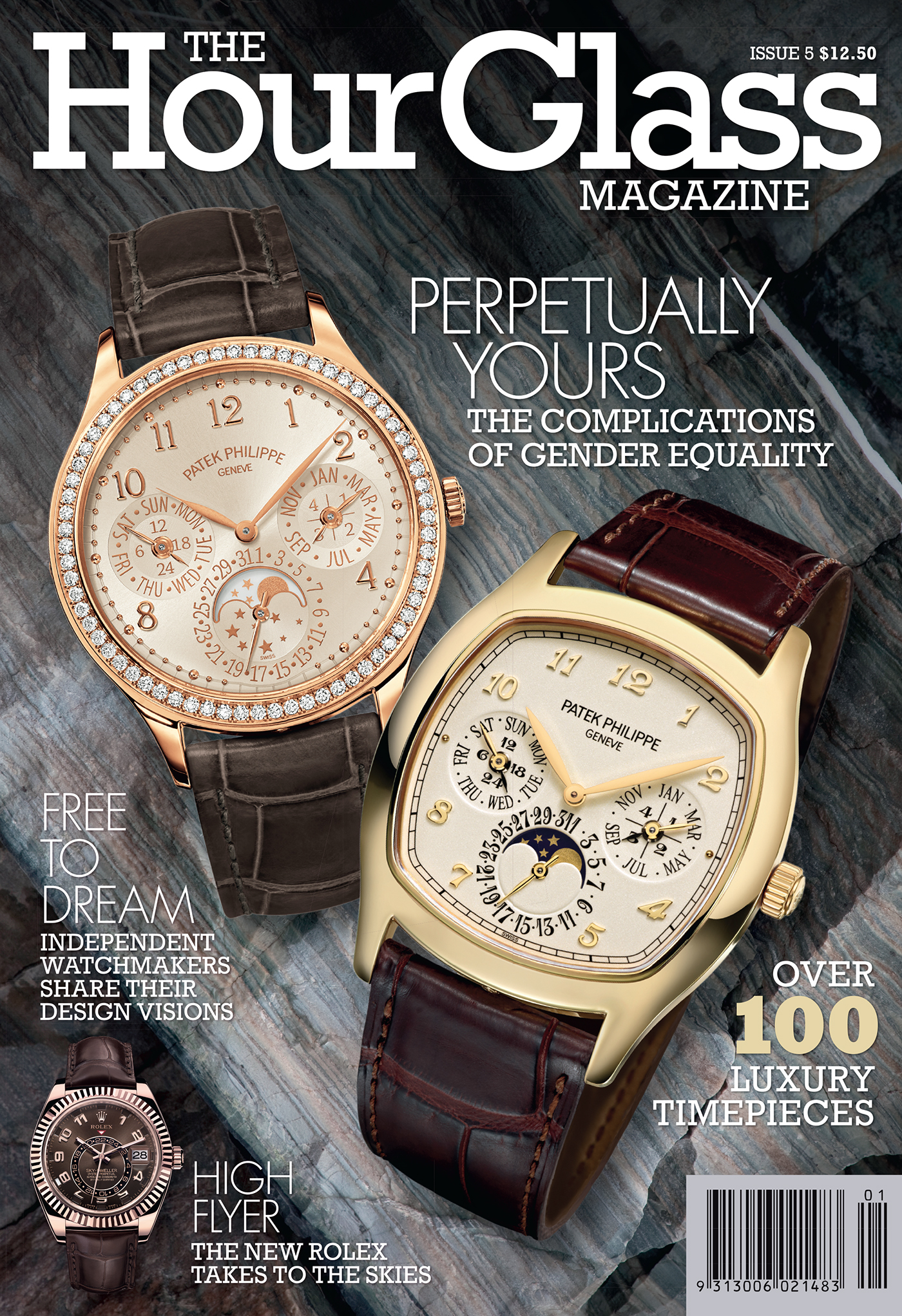
There were two designs for the mag. This is the original that lasted for four issues. I've put them together as I don't have a complete set of files.


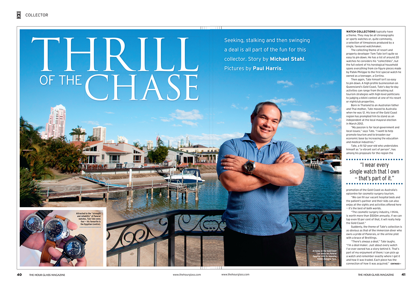
No, I didn't risk drowning or freezing the Panerai. I saw how much they cost and I Photoshopped it. Also they wouldn't send me one.


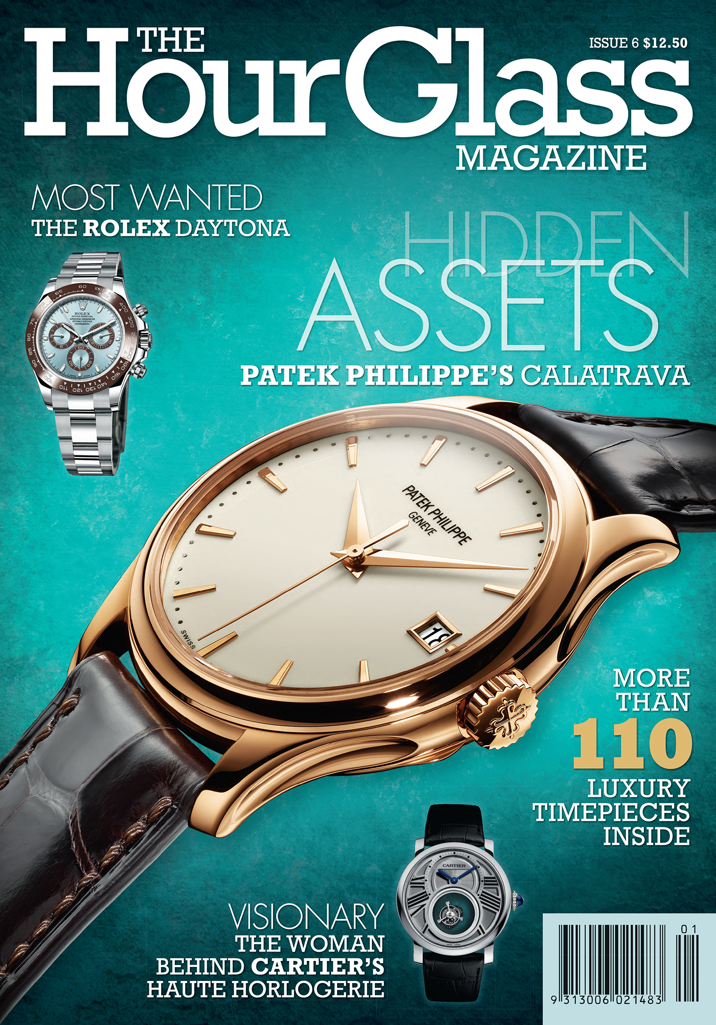
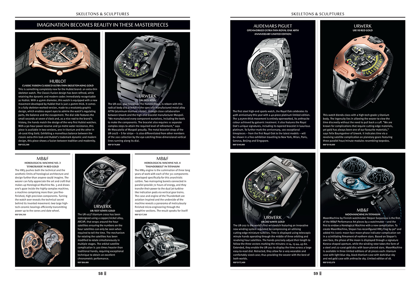
And here's the design for the last two issues I was involved with. I was really glad that, after we went from 1 watch on the first two covers then to 2 watches and then up again to 5 watches, that we went back to 3 for the last two covers.


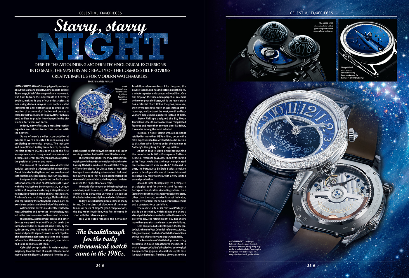
The Hour Glass suggested stars behind the text for this layout and it was difficult for me to easily explain just how difficult to read white type would be if there were white stars behind. By this point the people at The Hour Glass were really beginning to enjoy creating their magazine and, fortunately, they liked my compromise.